
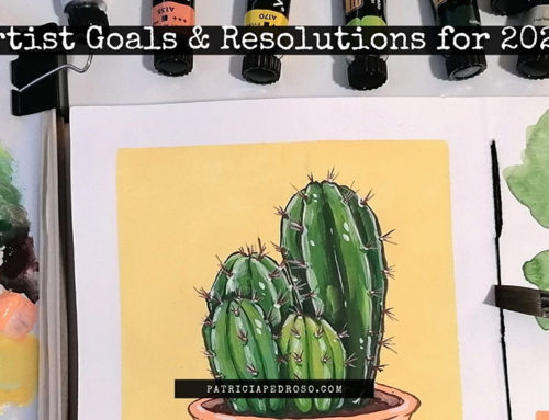
A basic guide to colouring
Do you feel like your art is lacking something? Maybe you struggle to get your colours to look right… Or maybe you feel frustrated when you look at other artists’ art and wonder how their colouring could even look like that.
But do not fret. We’ve all been there.
Colour theory can be intimidating, but I have some good news:
There’s no need for huge colour theory knowledge to begin improving your work. Just start with some basic things, and work your way up.
In today’s blog post I’m gonna be giving you some really basic, but nonetheless incredibly powerful tips, that would definitely give your colouring a boost if you start applying them.
Disclaimer: Colouring is a huge part of drawing and illustration, so eventually you’ll have to dedicate some time to learn about it, avoiding it is not helping you nor you or your art.
But, starting with these might be a good way to get acquainted with it without that much studying.

*Reminder that this post contains some affiliate links. This means I might get a small commission when you click and buy something with that link with no additional cost to you. However, my reviews and recommended products are not influenced by this, I’ll only recommend what I use and what I believe is good. Click here to read the disclaimer if you want more information*
Let’s start!
1 – AVOID USING BLACK AND WHITE
While mixing white or black in your paintings to get lighter/darker tones – or use it to add lighting or to shade in its digital counterpart – might seem like the logical thing to do, it’s actually not.
This is a very important thing to consider and it can drastically change your work. Black and white dull your work and also take away all the life in it.
You might use it, but carefully and knowing what you’re doing.
Why, you might be wondering?
Well, basically when you add white to a tone all you do is take away it’s vibrancy, creating a washed-out tone. – kinda pastel-looking, but that only works if that’s the look you’re going for.
Instead, try finding out other ways to lighten the tone. For example, try to lighten up a red mix it with a tiny bit of yellow, and just maybe, sometimes with a – really really small – touch of white.
For the black, most of the times it dulls your work, and it tends to produce muddy colours. You wouldn’t want muddy colours in your work, wouldn’t ya?
And for digital colouring, the same thing happens, sometimes it’s even more
Besides, light it’s almost never fully white, as well as a shadow is never fully black. It always has an undertone.
So, this comes with practice, but once you start considering this and slowly changing your habits you’ll see it works wonders!
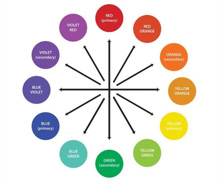
2 – KEEP THAT COLOUR WHEEL AT HAND
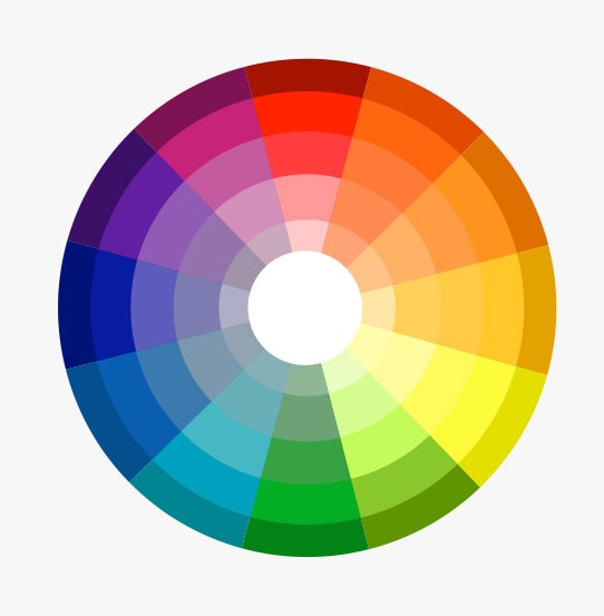
By
But if you don’t, I invite you to take 10-15 minutes to read a bit about it, it’s literally everywhere!
Some artist like to have one visible when they work.
Some might have an image somewhere on their computer and some just know it by heart, but believe me, we all need it from time to time.
I don’t really think I have much to add here, just knowing your basics – about complementary colours and such… – and keeping them it in mind can take you a long way.
3 – THE IMPORTANCE OF WARM AND COOL COLOURS TO REFLECT LIGHT/SHADE
This is much easier than what it sounds.
I’m gonna give you the simple version, you can always go and do some research if you want to know more.
Cool light/highlights –> warm shadows
Warm light/highlights –> cool shadows
If an object is receiving a warm light, the part that’s in shade or the shade itself would be cool. Similarly, if an object is receiving a cool light, then the shade would be warm.
Applying this when you’re lighting and shading a picture would improve a ton the look of your work.
Try to be conscious about it when you add your light sources in the pictures.
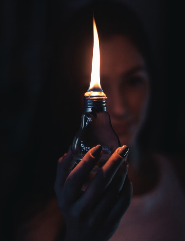
If something is lit with warm light – some warm light source examples would be candles, the evening sun or incandescent light bubbles – then do not shade with warm tones as well. Use cooler tones of the ones you have in the picture for shading.
Some examples of cool light sources might be a clear blue-sky day kinda light, or a cool white LED. There your shades should be warmer.
I’m gonna recommend a couple of Skillshare classes on this topic I took a while back that I think can be really useful, both of them by the artist Gabrielle Brickey, I love her courses cause they are simple and to the point but with a lot of valuable information! The first one is not exactly directly about colour but about Painting light and shadow.
And if you sign up with this link, you can try Skillshare for FREE for 2 months!
4 – KEEP A CLOSE LOOK AT THE WORLD AROUND YOU

Some of the things I just wrote you can easily see if you pay attention to the world around you.
Lately, most of us spend a lot of time focused on a screen and we’ve stopped looking around us. – not a guilt trip here, I know I do it too.
There’s much to learn from carefully observing how the light affects the colours, the volumes, objects, etc…
And I’m not only talking colour but a lot in art, in general, can be learned by observing the world around you.
5 – TURN YOUR WORK TO GREYSCALE
A really simple trick but it does wonders.
It’s more to see if your values are correct, but it can work for colouring values too, cause each colour translates to b&w with the different brightness or other properties that our eyes perceive.
If you turn your work into greyscale and it still works, then you’re doing it right.
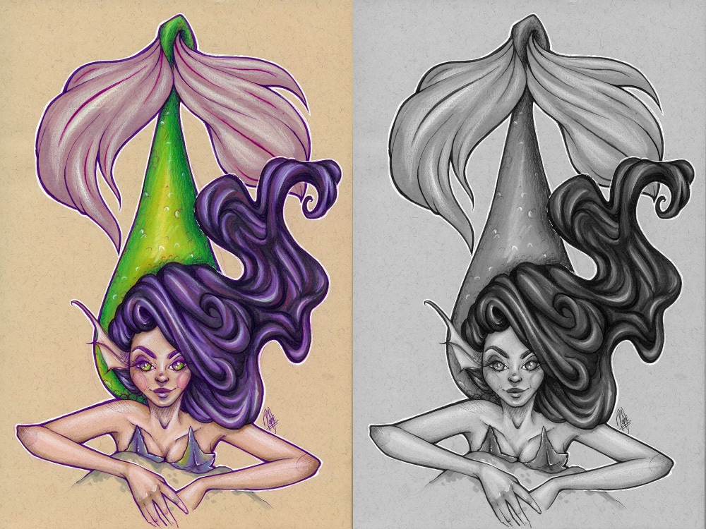
In black and white you’ll see mistakes much more clearly. And if it doesn’t work then maybe you need to rework the piece a bit more.
The good thing about this trick is that it takes seconds – yes, if you’re working traditionally too, just snap a picture and turn it into greyscale in your phone, no fancy edition needed – and you can do it as many times as you like to make sure you’re doing it right.
6 – SHADE WITH ANALOGOUS COLOURS
This has quite a lot to do with the “keep the colour wheel at hand” tip back there.
And with the avoiding the black and white.
With this tip, I basically mean that you should avoid using a lighter/darker tone of the colour your using and instead use a neighbouring colour, – which means the colours that are next to yours in the colour wheel – also called analogous colour.
You can find them easily if you keep that god old’ colour wheel at hand – at least until you basically know it by heart.
Let me give you an example: if you’re using green, you can use yellows for the highlights and blue-ish tones for the shadows.
Again, this would add vibrancy to your work and your colours, making it look more natural.
7 – USE THOSE COMPLEMENTARIES!
Back to the same here, using complementary tones is always a good thing to do, because it draws the eye.
But there’s really a lot of ways to apply this, one of them is to use this to choose complementary colours for the shades.
Let’s say for example for skin tones – orange/yellow/red undertones – it works wonders to shade them with purples and blues.
This is applied in a subtle way, do not think about super saturated tones here.
8 – COLOURS CHANGE AGAINST OTHER COLOURS
This is a really important thing to keep in mind, both for good and for bad.
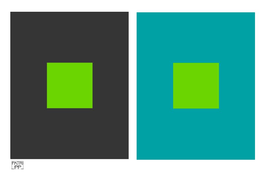
The colour you choose will not look the same against every colour.
It might appear really bright against your background and then really dull if you apply it against other tones – see the example. This can be really frustrating sometimes, but also good if you know how to use it.
Also, warm colours tend to stand out more than cool colors.
For example, a really cool trick that’s a perfect proof of this used to trick the eye is applying a saturated colour against a dark/black tone.
It would make it look like a neon/very bright colour! – Especially useful with digital, but works with traditional too.
9 – COLOUR COMPOSITIONS WITH COMPLEMENTARY COLOURS
Yes, I’m back at complementary colours, but the truth is that they are really important!
They would always have your back.
When in doubt about how to colour your piece, choose a complementary colour palette.
It doesn’t have to be the bright saturated yellow with a really bright purple you’re imagining in the colour wheel, it can be much subtler.
This sometimes can be seen as a “very beginner artist resource”, but truly, analyse the work of artists that you follow out there considered professionals and you’ll see they still do it.
Simple can be better.
Specially if you’re starting out, overcomplicating the colour palette without too much knowledge might ruin the piece.
10 – AN OBJECT COLOUR IS BOUND TO REFLECT SOMEWHERE ON THE REST OF THE PICTURE
This is one of the latest things I learned and it can really make your compositions look more cohesive with the things in them.

Let’s say, for example that you’re drawing a girl with a pink jacket, that jacket would reflect some light, right?
So, probably, the stuff around it would have some reflection of that pink.
It’s something subtle again, but incredibly powerful, cause it would give realism to the lighting and colour of the piece, and make it look like it belongs there.
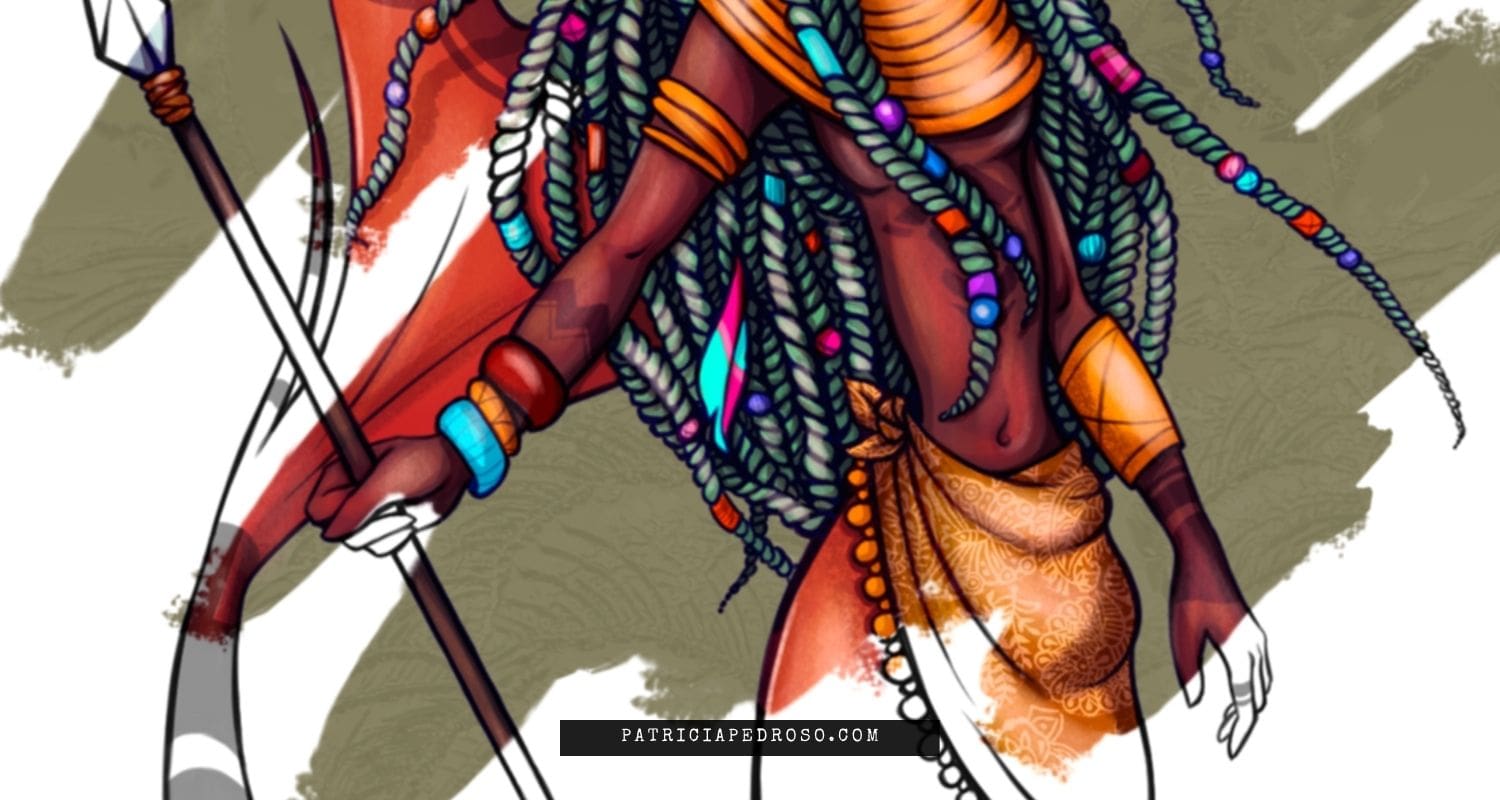
Just look at this picture and how the yellow reflects in different clothing, cause it’s the brightest colour. – there’s some red reflecting too.
Here’s the second class I wanted to recommend on Skillshare is this Colour workshop with all the basics for Artists and Illustrators. Again, I highly recommend basically any course by Gabrielle, I’ve binged almost all of them and they’re full of great info, well explained and with very useful resources.
And just in case you missed it before, with this link, you can try Skillshare for FREE for 2 months!
11 – DO SMALL COLOUR COMPOSITIONS
Every artist should do colour compositions, it’s really important.
I know we’re lazy, however, this does save you the trouble of re-starting a piece if the colour palete doesn’t work out.
Nowadays with the iPad Pro and all these digital media, it only takes a second to snap a photo of your artwork – if you’re working traditionally – and put some colours in it to see how they look.
You can also do mini-paintings to try out how your colours would react together and give you a better view of what you’re getting.
Really, this can save you so much time.
I’m still working on slowly implementing it myself, but whenever I want to work on an important piece or on something I want to have really in control I simply do small colour comps and the actual painting process later is much smoother!
And with a hella lot less stress.
It’s a win-win situation!
I know the feeling of wanting to get right on with it, but I also know the frustration that comes when you ruined your work because you didn’t think your colours through.
12 – BONUS TIP ABOUT COLOURING: GET CRAZY!
All of us tend to get comfortable with our colour palettes and stick to what it works.

And that’s perfectly fine!
As I mentioned on my 7 Things you should know to start with Gouache post, it’s been so good for me to add crazy colours or try really different colour combinations to improve and get comfortable with colouring.
It’s what would help you improve in the long run.
So, once you’ve mastered most of these tips try to vary your colour palettes and see what it can do for your work.
There’s always time to go back to basics.
13 – WORK WITH THE RULES TILL YOU KNOW THEM WELL ENOUGH TO BREAK THEM
I bet you have heard this expression before – and it’s so true!
I know that we, as artists, don’t like to follow rules and having people telling us what to do.
But it’s really important to know basic colour theory and a bunch of other stuff if you really want your art to improve.
So, you will have to learn about colouring – and lightning, cause they’re really related to each other – and after you do, then you can allow yourself to experiment.

One really amazing example of great colouring – and everything really – that I wanted to mention is the artist Lois Van Baarle, also known as Loish.
She has a couple of books that are really great and inspirational, while she also gives you advice and things that she has learned.
And she also has mini-tutorials on the internet, but really, only with observing her art, you can learn so much! – I know I have
That was it! Colouring basics in a nutshell.
I’m thinking about doing a course over on Skillshare (or in the blog itself) in the future about this because I think it can help someone out there.
I believe that reading something like this a few years back would have helped me a lot.
So, do tell me your thoughts on this in the comments if you found something useful, and you can also subscribe to my newsletter if you want me to keep you updated!

